


Kiosk UX + UI Design
This project is a redesign of a scientific research facility visitor ticket kiosk. I conducted user research, and user feedback showed the kiosk to be overly complex and confusing, and to contain an excessive number of input fields for unnecessary information. The existing kiosk also had poor user flow, and was lacking in accessibility. Additionally, the kiosk only provided tickets via phone text, but the facility itself required visitors to turn off cell phones, which meant that tickets and receipts could not be displayed or verified once they were purchased. I completed this design using Figma, Adobe Photoshop, and Adobe Illustrator.
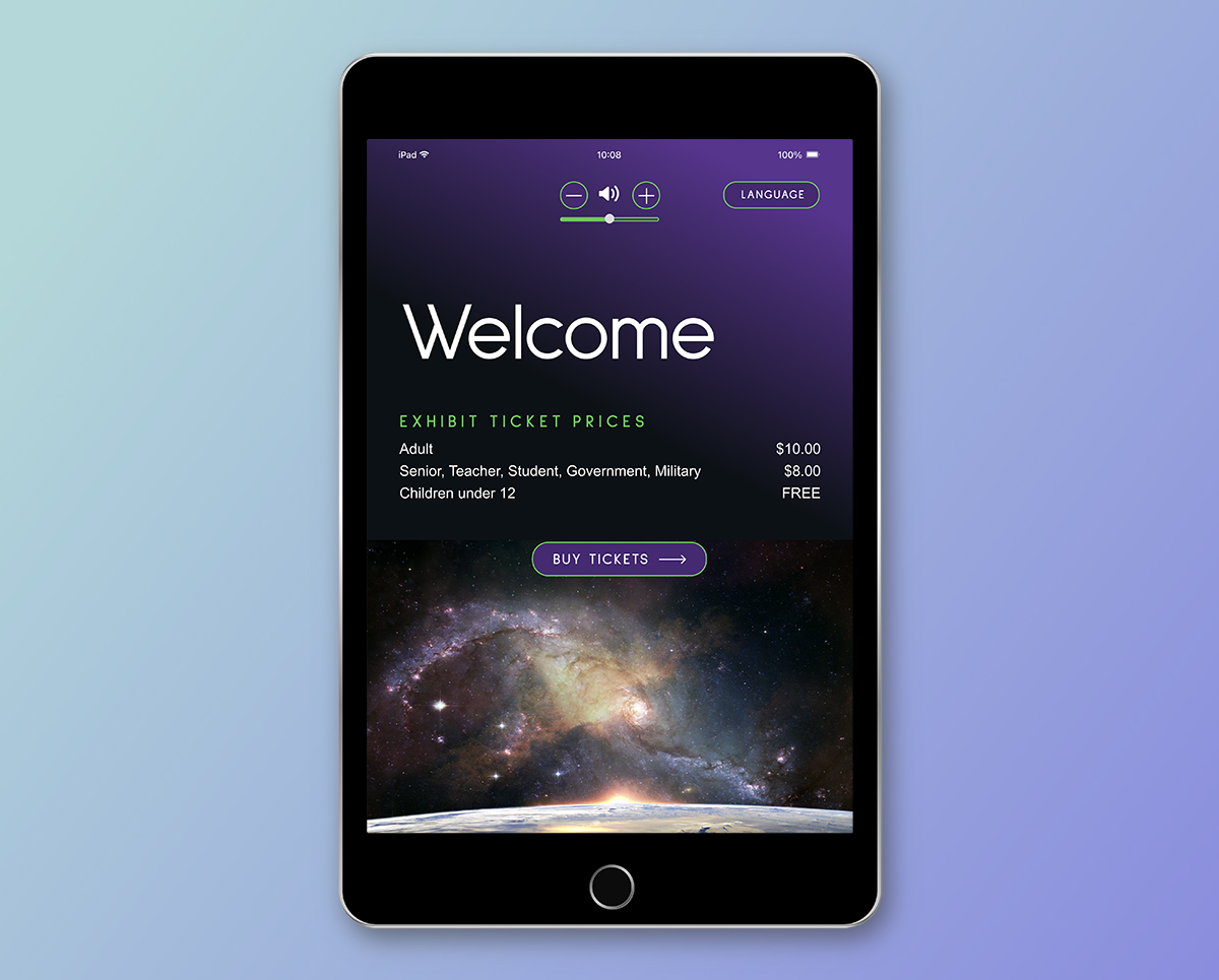
Changes were made to address accessibility issues
- The kiosk iPad was remounted to an adjustable height arm that allowed input by users of all heights, standing and seated.
- Accessibility was improved by providing voice-activated field inputs and speech recognition plus voice feedback and volume adjustment.
- Because the facility hosts visitors from around the world, language options were also added to provide access for a broader audience.
Changes were made to address functionality issues
- The amount of user input information was reduced and streamlined.
- User flow was streamlined for multiple ticket purchases, including a different input mechanism for special tickets and price reduction.
- Visitors are provided with a paper ticket, and simple electronic employee access to visitor sign-ups was added so tickets may be verified electronically when the paper ticketing device is not functional. Receipts are still emailed to visitors since this is a universally accepted and expected behavior for ticket receipts.
Functional and attractive UI design created
A new functional, modern, and attractive UI design was created to align with the enhanced user experience. Colors, imagery, and typography were selected for the design to provide improved accessibility and appropriate visuals and feel for the organization’s theme and mission. Buttons, sliders, and other interactive features were also designed to provide improved accessibility and using a design system for a cohesive experience.